My last course in the Data Analyst nanodegree was about data visualisation in Tableau. I didn’t have a lot of experience with Tableau before, but now I fell in love with the software quite fast. (I tried it many years ago, but I left, partially because the hefty license fees back then).
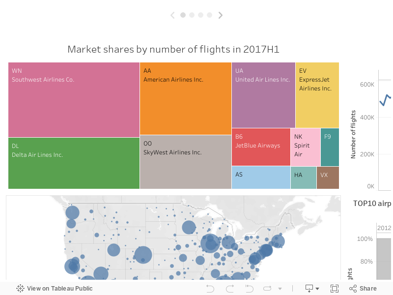
So this is what I submitted for the assignment. I downloaded the data from the Bureau of Transportation Statistics, and used it without any major modifications, as the real goal of the project was to create an engaging visualisation.
Unfortunately I did not optimize the layout for embedding, so for the best experience click ‘Full Screen’ at the bottom, or check out the original on Tableau Public). You can switch between slides at the top with the arrows or by clicking the dots.
In general I’m satisfied of what came out of my first excursion, even though I obviously only explored a tiny little part of Tableau. My heart aches when I think about all those boring Excel charts I created all these years…